| About Me |
| Publications |
| Projects |
| Contact Me |
For this project I focused a lot on interior lighting and using image textures for different surfaces. Strangely, the scene did not have any groups or hierarchies instead similar objects were part of a single mesh. For example, all the cabinets were a single mesh. This made things a lot more difficult to shade. I started off with the bed and the pillow. For these I simply used a lambert with image textures and a very small bump to give it a cloth feel. Next, I used the same technique with the comforter but for the bump I used the image pattern below. This gave it a really nice stitching pattern like feel.
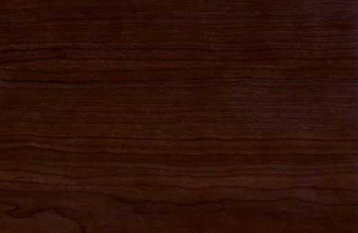
For the poster, I simply used images above (source google) and the wall is a lambert. I used an image for the floor as well. I had to replace the floor already in the scene with a flat plane since the texture did not line up with the floor very well and there were big gaps between the planks in the floor. All the cabinets and side tables use a polished wood texture attached to a blinn’s color channel and also to its bump channel. The texture is below.

For a lot of the objects, I used mia_material_x mental ray shader. I simply started with the presets and tweaked them until I got the result I wanted. The bedside lamp and the chair are glossy finish material. Same is true for the guitar, except for the neck which used a wood texture. The glossy plastic preset was used for the heater on the wall and the laptop on the chair. The knobs on the side tables, guitar strings and the spring on the night lamp all use the chrome material preset. The night lamp is a little different. It used a glossy preset along with the mental ray lighting surface material attached to its additional color channel to give it the glow. There were a few other settings I had to tweak to make it glow, the final gather contribution on the material and the intensity of the glow and also the accuracy of the final gather to make it less grainy. I used this instead of the regular glow on Maya material as this makes it look as if the glow is coming from the object instead of just giving a glowing aura around the object. The guitar amp uses the same technique as the cabinets and tables on the exterior. It uses a crack plastic texture for both color and bump. The grill however is just a grill image texture with a grayish color gain.
For the plastic on the bottle, the lid and straw of the fountain soda cup, I used a Phong E with transparency and a slight bluish specular to make it look plastic-ky.
A close up of the amp and the bottle can be seen below along with the first version of the project.